Journalism Trust Initiative Full Redesign

Duration
Jan-May 2025
Product Designer
Reporters Without Borders, Journalism Trust Initiative
Me (Product Designer ), Tetiana T (UI), Yafar U (PM), 3 Awesome Developers
B2B, SaaS, Multi-role Platform, Information Architecture
Problem
create a unified, user-friendly platform that clearly communicates JTI’s mission, builds trust with the public, and streamlines the certification process for media outlets, certifiers, and administrators?
Solution
The solution involved redesigning and unifying the public website and internal platform of a global journalism initiative. The goal was to modernize the experience, communicate the mission clearly, and simplify the certification journey for Media Outlets, Certifiers, and Administrators.
Key design improvements included:
A unified human-centered interface aligned with accessibility and clarity standards.
Role-based dashboards and guided workflows for different user types.
Streamlined submission and review flows for both certification and re-certification.
A public-facing site that promotes trust and visibility of transparency reports.
"
We needed a unified digital space where our stakeholders - from news publishers to academic researchers and funders - could easily access the information they need without the confusion of switching between platforms.
"
Bertrand Mossiat, JTI stakeholder
Here is how I did the Research:
Research
To build a deep understanding of the platform’s ecosystem, we began with an intensive 2-week research phase.
While waiting for access to the certification platform and gathering participants for interviews, I focused first on the public-facing website redesign. I conducted a benchmark analysis and created a mood board to align on tone and structure. To accelerate the benchmark phase, I used AI to rapidly scan and cluster patterns across competitor platforms, identifying recurring UX conventions in media trust and certification products. This compressed what would typically be a 3–4 day manual analysis into a single focused session, letting me arrive at the stakeholder workshop with structured insights rather than raw screenshots.
To define the site's purpose and priorities, I facilitated a workshop with stakeholders to clarify the organization’s mission, target audiences, and key content. This collaborative session helped establish a shared vision and laid the foundation for a website that clearly communicates the client's goals and values.


II Workshop
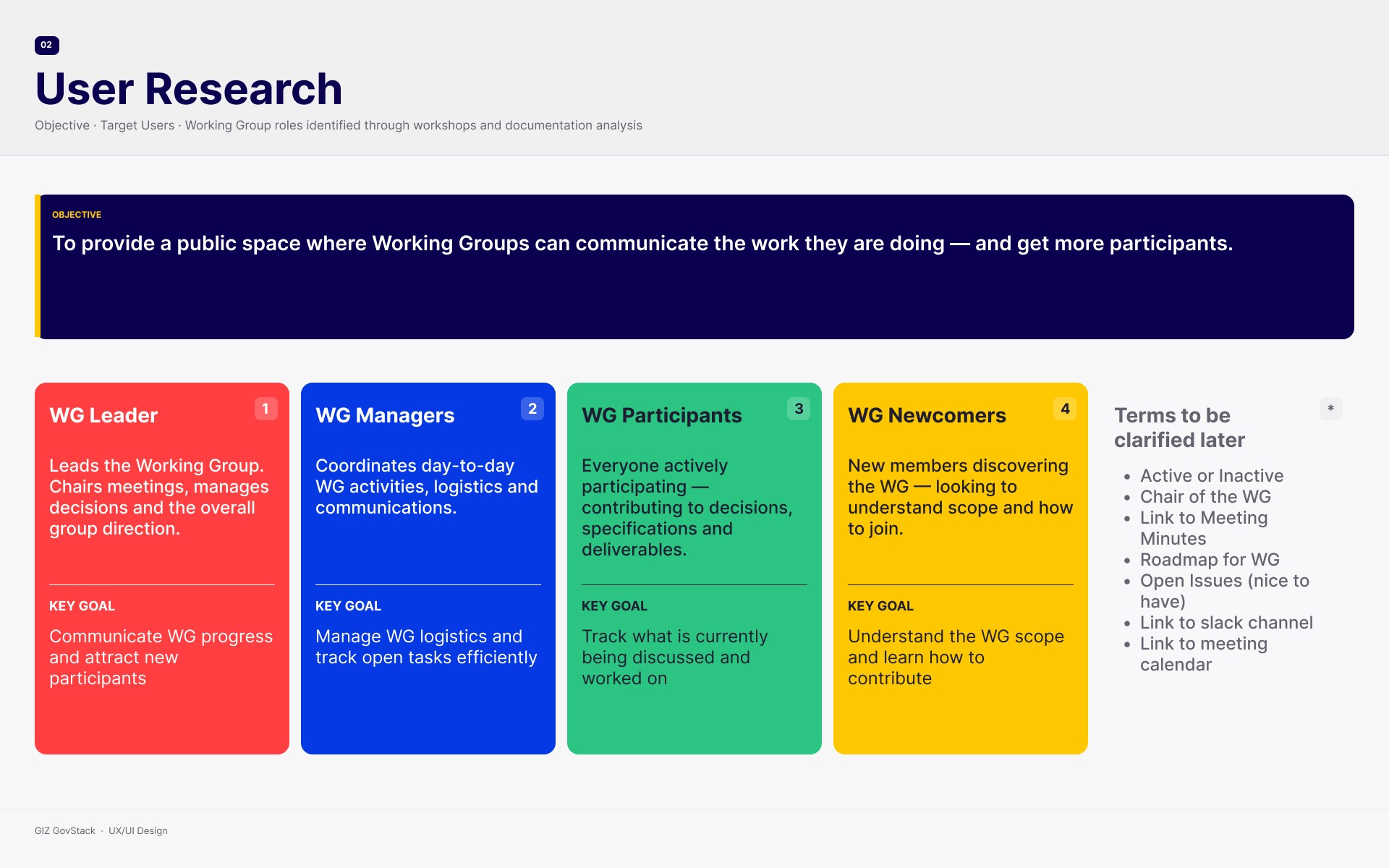
As a next step, I conducted a second workshop with key stakeholders to refine our understanding of the platform’s users. Together, we identified and prioritized the core user groups, removed redundant ones, and explored what features each group truly needed. Through collaborative persona creation, visual style definition, and open brainstorming, we mapped out the essential content and functionality the website was missing, ensuring it would deliver relevant, clear, and accessible information for everyone it serves.
User Interviews
As part of the redesign process, I conducted in-depth interviews with current users of the JTI platform to understand their real experiences, frustrations, and needs. We explored how they engage with the platform during the certification process and what improvements they envision. After each interview session, I used AI to identify recurring patterns across transcripts and surface themes I might have missed in manual review. This helped me move from raw notes to a prioritised insight map significantly faster, and gave me confidence that nothing critical was buried in the data before bringing findings to the team. A key insight was that the website didn’t explain what media outlets gain from JTI certification, making its value unclear and discouraging engagement.


Here is how I Designed it:
Ideation
Before moving to Figma, I used AI to rapidly prototype several alternative flow structures based on the workshop data testing different role-separation models in minutes rather than hours. The version shown is the one that survived stakeholder review; the discarded alternatives are what shaped it. It visualizes the certification journey on the JTI platform, highlighting the key actions and responsibilities of Media Outlets, Certifiers, Admins, and Public Visitors. I created it as part of the UX process to better understand user roles, clarify interactions, and guide feature prioritization during the redesign. It served as a shared reference point for both stakeholders and the design team.



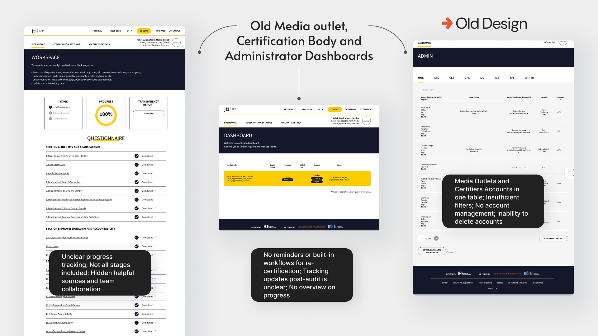
Previous Design
Previous UI
The previous JTI interface struggled with clarity and structure. Information was dense and visually similar, which made it difficult for users to quickly understand priorities, status, or next steps in the certification process. Navigation was not aligned with different user roles, so many users saw options that were irrelevant to them. As a result, workflows felt more complicated than they needed to be and completing tasks required unnecessary effort.

Design System
Before starting with screens, we co-created a new design system. We kept the essence of Journalism Trust Initiative visual identity but introduced modern typography and colors.

Iterations
Through an iterative design process, we transformed the JTI certification platform into a clear, user-centered experience. Each round of user testing and feedback refined the flow, simplifying navigation, clarifying certification stages, and connecting media outlets with certifiers more intuitively.


Use the slider to compare the first and final versions of the Media Outlet Dashboard.
Key improvements
Public facing website
Clear Value Proposition: A bold, mission-driven homepage now explains what JTI is and why it matters at a glance.
Certification Benefits: Media outlets can instantly see what they gain from certification: visibility, trust, and credibility.
Human Touch: Introduced JTI team profiles, office contacts, and real success stories to boost credibility and connection.
Interactive Global Map: Users can explore certified media outlets by country with advanced filtering.
Event Access: Visitors can now register for events and meet the JTI team in person.


Key improvements
Certification Platform
End-to-End Certification Journey: Redesigned flows guide users seamlessly through every stage—from self-assessment to re-evaluation—removing confusion and improving completion rates.
Smart Progress Tracking: Interactive progress bars and clear status indicators (“Approved,” “To Revise,” “In Review”) help users instantly understand their certification stage.
Unified Communication & Collaboration: Collaborator management tools and certifier feedback channels now make teamwork transparent and efficient.
Enhanced Transparency Report Experience: Publishing, previewing, and sharing reports is now effortless—with “Copy Link,” “Download,” and “Submit for Certification” actions placed upfront.
Data-Driven Admin Tools: New Admin Dashboard enables filtering, tracking, and exporting of all certifications, ensuring better oversight and accountability.




Outcome
The redesigned JTI platform improved both the user experience and operational efficiency by addressing key usability pain points and aligning the system with user expectations across all roles. With growing national attention in France, where the president publicly endorsed JTI as a potential standard for media certification, the platform is now positioned for broader trust and adoption.
Measured outcomes inspired by the HEART framework and Outcome/Impact mapping:
Certification completion rate increased from approximately 34% to 51%, tracked across the first 100 organizations to use the redesigned flow, reflecting fewer points of confusion, clearer next steps, and easier collaboration during the process.
Support requests from media outlets dropped approximately 38% in the 8 weeks after launch, compared to the pre-launch weekly average, thanks to improved in-platform guidance and visibility of key steps.
Increased team collaboration through visible contributor roles and simplified access management.
Higher transparency report publication rate, as users now understand what they gain from certification.
Average certifier review time shortened from ~22 days to ~15 days, due to better communication tools between media outlets and certifiers.
Improved discoverability of certified outlets via public-facing interactive map and clearer site structure, with 6 of 7 stakeholders confirming after launch that the new flow matched their mental model of the process.