GIZ GovStack Website Redesign

Duration
Jul-Nov 2025
UX/UI Designer
Relief Applications
Me (UX/UI Designer), Yafar U (Technical Lead), Cedric S (PM), 2 Amazing WordPress Developers
B2B, Exnterprise UX, Information Management, Redesign
Problem
How might we redesign GovStack's public website so that a government official, a working group contributor, and a software provider each find their path within 30 seconds of landing?
Solution
The redesign covered four areas. A new landing page structured around GovStack's value proposition rather than internal project logic. A Working Groups hub that brought the tech community's activities out of Confluence and into public view for the first time. A GovMarket with building block filters and randomized listing order. A custom illustration set to give abstract technical concepts a consistent visual language across the site.
"
The display of the softwares has some little political implications. What is the first one to be displayed? How big are they displayed? Why do I need to scroll 10 times to find my software? Currently, every time you go on building block software, it is one solution, which is called MOSIP at the start, and people don't like that. Every time the same, which is the first one. It feels like an advertisement. Our goal is to be neutral as much as possible.
"
Nico Lueck, Leader of the product management team in GIZ GovStack
How I did Research
Research
The first was a live brainstorming session on FigJam. The team and me worked through the landing page and site structure together in real time, generating five versions of the layout to test different framings of the value proposition and user paths. The board went from rough navigation sketches to increasingly specific wireframe iterations, each one resolving some questions and surfacing new ones: what goes above the fold, how explicit the step-by-step journey should be, how to give government officials and community members equally clear entry points from the same page, where partners and the world map fit into the hierarchy. By the end of the session we had a shared sense of direction and a set of open decisions to carry into the next phase.


II Workshop
The second went wide across site priorities: GovMarket filter options, the logo wall, world map display concepts, landing page restructuring, and the Events section. Martha mentioned she had been sketching a rough landing page layout on a beach in Estonia — that sketch fed into the direction we landed on. Ali, who manages all working group and specification work at GovStack, walked the team through how working groups actually function week to week: Confluence pages invisible outside the team, Slack channels where decisions got made, decision records that had no public home. She had already built a working prototype on a static site generator and shared the IETF working group model as a reference for what a public community page could contain: name, charter, members, calendar, minutes, and specifications in one place.
By the end of both sessions I had a map of what each user group needed and where the current site was failing each of them.
Before any design work, I mapped the project scope and sequence: which sections to redesign, in what order, and where the design decisions connected to the development pipeline. That map became the reference for the whole engagement and kept the team aligned on what was in scope for each phase.

How I Framed it
User Research
Steps
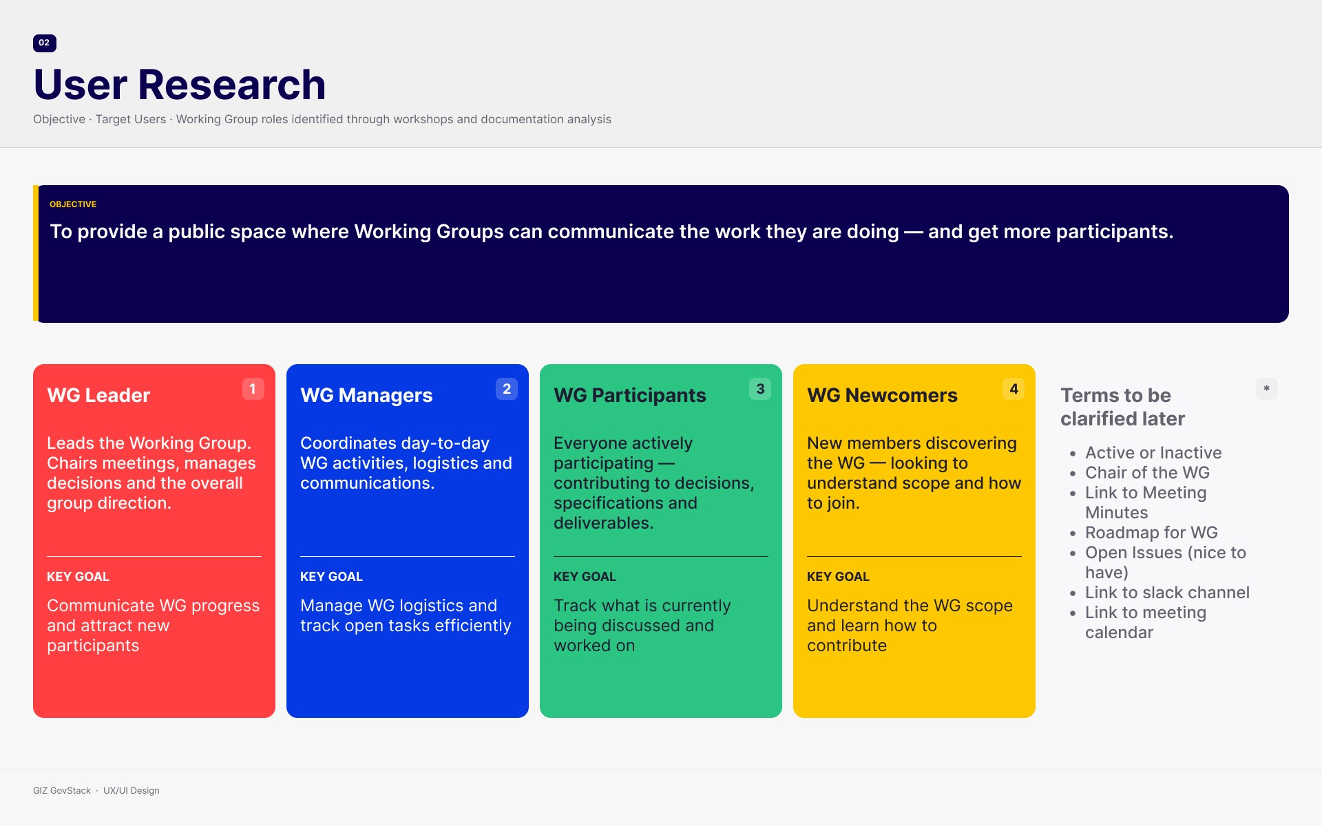
Two workshops surfaced three user groups, each failing to get what they came for. The tech community had no public presence; their materials scattered across Confluence and Slack, invisible to newcomers. Government officials could not tell what GovStack did for them. Software providers did not understand compliance levels or why listing mattered. Ali's walkthrough showed these paths were not independent: a government official, a contributor, and a software provider often move through connected parts of the same system, so features could serve more than one group at once. We classified the features into MVP, first iteration and to consider later. That list sat alongside the GovMarket and landing page requirements in the prioritization matrix. The building block filter in GovMarket came out as the highest-priority feature, flagged by both groups.


How I Designed it
Design System
GovStack already had a style guide. Rather than starting over, I extracted the color palette, typography, and base components and extended them into a working design system for the redesigned site. The goal was consistency across all four areas of the redesign without inventing a new visual language.

Hero Section
Versions
Three approaches to the hero section. Stakeholder's brief was direct: government users need to understand what GovStack offers before they scroll anywhere. Each version tested a different way of framing that value proposition. This element went through more rounds than anything else in the project, because getting the first impression wrong meant losing the user before they saw any of the other content.

Landing Page
Steps
The landing page structure followed a simple logic: value proposition first, then a step-by-step explanation of how GovStack works, then clear paths to the three main sections. The slides here show the intermediate decisions, including two rounds that got cut before the final version landed.
Government officials land and see what GovStack does and why it matters. The step-by-step section explains the flow from writing specifications through to country implementation. Working group contributors and software providers each have a clear entry point from the same page.


Working Groups Hub
Tech Comm
Around 200 volunteer experts meet weekly to write open technical specifications for GovStack — blueprints for digital wallets, identity systems, and more. None of that work was visible on the website. Meeting notes lived in Slack. Working group pages were internal Confluence documents a newcomer would never find. The hub changed that.

Working Groups
Materials
The third workshop was the most information-dense of the three. Ali shared their Confluence setup, her working prototype, and the IETF model she had been using as a reference for what a public community page could contain. She also clarified something I had not fully grasped until that session: these are not internal team pages. They are meant to be public, discoverable, and clear enough that a newcomer can orient themselves without interrupting the weekly meeting.


Working Groups
Wireframes/UI Final
I did two rounds of iterations. The first mapped the information architecture: a hub overview with one card per working group, then a detail page per group. The second round refined the layout, added the calendar feature, and separated the public overview from the subscription and participation flow.
The final UI for the Tech Community hub and individual working group pages. The hub shows all active groups at a glance. Clicking through opens the group's detail page with member profiles linked to LinkedIn, upcoming meeting dates with calendar integration, meeting minutes, and published specifications. Anyone can read the page. Joining a meeting is one click.


GovMarket
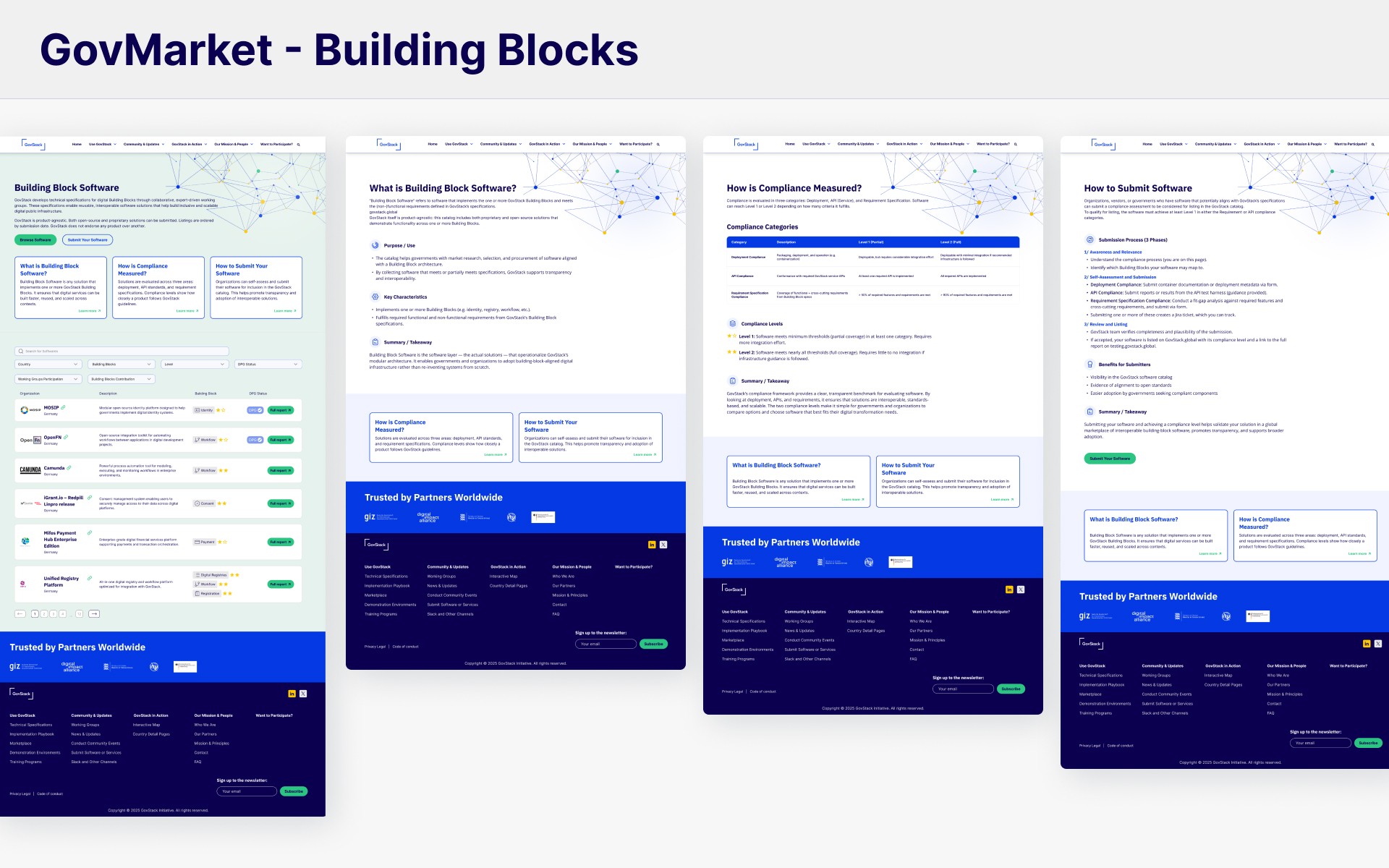
GovMarket lists software tools and service providers compliant with GovStack specifications. Before the redesign, it showed a small number of solutions with no filtering and always placed the same tool at the top. The redesign added building block filters, richer metadata per listing, and randomized display order on every page load. Those three changes together addressed the neutrality problem directly.


Illustrations
BB Specs & WG
The building block spec templates help users understand what a specification does before they read the technical content. The working group illustrations give the community hub a human quality that the Confluence pages never had.


Outcome
3 user groups mapped and given distinct paths through the site
4 major sections redesigned: Landing Page, Working Groups hub, GovMarket, Specifications
3 discovery workshops conducted, producing a feature prioritization matrix and a full information architecture map
Working Groups hub designed for 15+ active groups, making their work publicly visible for the first time
GovMarket rebuilt with building block filters across 60+ listed solutions, plus randomized listing order
Custom illustration set for both the specification pages and the community hub
Design system extended from GovStack's existing style guide and applied across all redesigned sections